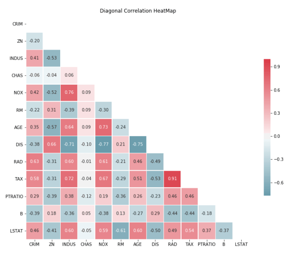
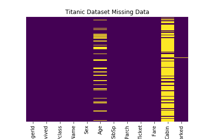
Boston Housing prices dataset is used for 1, 2. Titanic Dataset for item 3.
Basic Python module import
import pandas as pd
import numpy as np
import seaborn as sns
import matplotlib.pyplot as plt
% matplotlib inline

from sklearn.datasets import load_boston
boston = load_boston()
X = boston.data
y = boston.target
df = pd.DataFrame(X, columns= boston.feature_names)
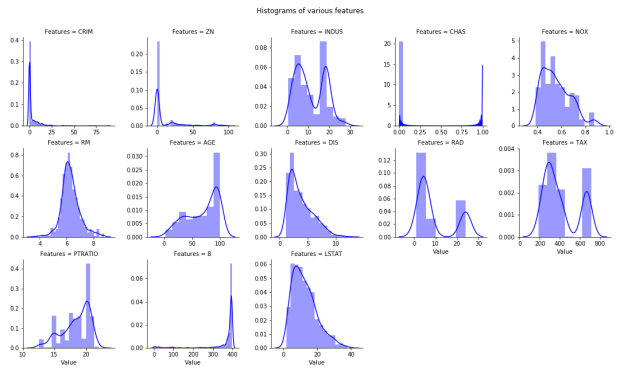
Multiple Histogram plots of numeric features
Stack the dataframe with all the features together. May consume significant memory if dataset have large number of features and observations.
If need to separate by group (hue in FacetGrid), can modify the numeric_features:
from google.colab import drive
drive.mount(‘/content/drive’)
View list of files:
!ls “/content/drive/My Drive”
Note: In the notebook, click on the charcoal > on the top left of the notebook and click on Files, select the file and right click to “copy path”. Note the path must begin with “/content/xxx”
I created a more generic text cleaning function that can accommodate various text data sets. This can use as a base function for text related problem set. The function, if enabled all options, will be able to perform the following:
Converting all text to lowercase.
Stripping html tags especially if data is scrapped from web.
Replacing accented characters with closest English alphabets/characters.
Removing special characters which includes punctuation. Digits may or may not be excluded depending on context. (Digits are not removed for this data set)
Removing stop-words (simple vs detailed. If detailed, will tokenize words before removal else will use simple word replacement.
Removing extra white spaces and newlines.
Normalize text. This either refer to stemming or lemmatizing.
In this example, we only turn on:
converting text to lowercase
remove special characters (need to keep digits) and white spaces,
do a simple stop words removal.
As mentioned in previous post, it is likely a seller would not include much stop words and will try to keep the title as concise as possible given the limited characters and also to make the title more relevant to search engine. As the text length is not too long, will skip normalizing text to save time.
# Text pre-processing modules
from bs4 import BeautifulSoup
import unidecode
import spacy, en_core_web_sm
nlp = spacy.load('en_core_web_sm', disable=['parser', 'ner'])
from nltk.corpus import stopwords
from nltk.tokenize import word_tokenize
from nltk.stem import PorterStemmer
STOPWORDS = set(stopwords.words('english'))

# Compile regular expression
SPEC_CHARS_REPLACE_BY_SPACE = re.compile('[/(){}\[\]\|@,;]')
SPEC_CHARS = re.compile(r'[^a-zA-z0-9\s]')
SPEC_CHARS_INCLUDE_DIGITS = re.compile(r'[^a-zA-z\s]')
EXTRA_NEWLINES = re.compile(r'[\r|\n|\r\n]+')

## Functions for text preprocessing, cleaning

def strip_htmltags(text):
    soup = BeautifulSoup(text,"lxml")
    return soup.get_text()

def replace_accented_chars(text):
    return unidecode.unidecode(text)

def stem_text(text):
    ps = PorterStemmer()
    modified_txt = ' '.join([ps.stem(word) for word in text.split()])
    return modified_txt

def lemmatize(text):
    modified_text = nlp(text)
    return ' '.join([word.lemma_ if word.lemma_ != '-PRON-' else word.text for word in modified_text])

def normalize(text, method='stem'):
    """ Text normalization to generate the root form of the inflected words.
        This is done by either "stem" or "lemmatize" the text as defined by the 'method' arguments.
        Note that using "lemmatize" will take much longer to run compared to "stem".
    """
    if method == 'stem':
        return stem_text(text)
    if method == 'lemmatize':
        return lemmatize(text)
    print('Please choose either "stem" or "lemmatize" method to normalize.')
    return text

def rm_special_chars(text, rm_digits=False):
    # remove & replace below special chars with space
    modified_txt = SPEC_CHARS_REPLACE_BY_SPACE.sub(' ', text)

    # remove rest of special chars, no replacing with space
    if rm_digits:
        return SPEC_CHARS_INCLUDE_DIGITS.sub('', modified_txt)
    else:
        return SPEC_CHARS.sub('', modified_txt)

def rm_extra_newlines_and_whitespace(text):
    # rm extra newlines
    modified_txt =  EXTRA_NEWLINES.sub(' ', text)

    # rm extra whitespaces
    return re.sub(r'\s+', ' ', modified_txt)

def rm_stopwords(text, simple=True):
    """ Remove stopwords using either the simple model with replacement.
        or using nltk.tokenize to split the words and replace each words. This will incur speed penalty.
    """
    if simple:
        return ' '.join(word for word in text.split() if word not in STOPWORDS)
    else:
        tokens = word_tokenize(text)
        tokens = [token.strip() for token in tokens]
        return ' '.join(word for word in tokens if word not in STOPWORDS)

def clean_text(raw_text, strip_html = True, replace_accented = True,
                normalize_text = True, normalize_methd = 'stem',
                remove_special_chars = True, remove_digits = True,
                remove_stopwords = True, rm_stopwords_simple_mode = True):

    """ The combined function for all the various preprocessing method.
        Keyword args:
            strip_html               : Remove html tags.
            replace_accented         : Convert accented characters to closest English characters.
            normalize_text           : Normalize text based on normalize_methd.
            normalize_methd          : "stem" or "lemmatize". Default "stem".
            remove_special_chars     : Remove special chars.
            remove_digits            : Remove digits/numeric as special characters.
            remove_stopwords         : Stopwords removal basedon NLTK corpus.
            rm_stopwords_simple_mode : skip tokenize before stopword removal. Speed up time.
    """

    text = raw_text.lower()

    if strip_html:
        text = strip_htmltags(text)
    if replace_accented:
        text = replace_accented_chars(text)
    if remove_special_chars:
        text = rm_special_chars(text, remove_digits)
    if normalize_text:
        text = normalize(text, normalize_methd)
    if remove_stopwords:
        text = rm_stopwords(text, rm_stopwords_simple_mode)

    text = rm_extra_newlines_and_whitespace(text)

    return text
Grid Search for Hyper Parameters Tuning
Using pipelines, it is easy to incorporate the sklearn grid search to sweep through the various the hyper parameters and select the best value. Two main parameters tuning are:
ngram range in CountVectorizer:
In the first part, we only looking a unigram or single word but there are some attributes that are identified by more than one word alone (eg 4G network, 32GB Memory etc) therefore we will sweep the ngram range to find the optimal range.
The larger the ngram range the more feature columns will be generated so it will be more memory consuming.
alpha in SGDClassifier
This will affect the regularization term and the learning rate of the training model.
With the ngram range and alpha parameters sweep and the best value selected, we can see quite a significant improvement to the accuracy to all the attribute prediction compared to the first version. Most of the improvement comes from the ngram adjusted to (1,3), meaning account for trigram. This is within expectation as more attributes are described by more than one word.
# Prepare model -- Drop na and keep those with values
def get_X_Y_data(x_col, y_col):
    sub_df =  df[[x_col, y_col]]
    sub_df.head()
    sub_df = sub_df.dropna()
    return sub_df[x_col], sub_df[y_col]

# Model training & GridSearch
def generate_model(X, y, verbose = 1):

    text_vect_pipe = Pipeline([
                            ('vect', CountVectorizer()),
                            ('tfidf', TfidfTransformer())
                            ])

    pred_model = Pipeline([
                ('process', text_vect_pipe),
                ('clf', SGDClassifier(loss='hinge', penalty='l2',alpha=1e-3, random_state=42, max_iter=5, tol=None))
               ])

    parameters = {}
    parameters['process__vect__ngram_range'] = [(0,1),(1,2),(1,3)]
    parameters['clf__loss'] = ["hinge"]
    parameters['clf__alpha'] = [5e-6,1e-5]

    X_train, X_test, y_train, y_test = train_test_split(X, y, test_size=0.3, random_state = 42)

    CV = GridSearchCV(pred_model, parameters)
    CV.fit(X_train, y_train)
    y_pred = CV.predict(X_test)

    print('accuracy %s' % accuracy_score(y_pred, y_test))
    print("=="*18)
    print()
    print("Details of GridSearch")

    if verbose:
        print('Best score and parameter combination = ')
        print(CV.best_score_)
        print(CV.best_params_)
        print()
        print("Grid scores on development set:")
        means = CV.cv_results_['mean_test_score']
        stds = CV.cv_results_['std_test_score']
        for mean, std, params in zip(means, stds, CV.cv_results_['params']):
            print("%0.3f (+/-%0.03f) for %r"
                  % (mean, std * 2, params))
        print("=="*18)
        print()

    return CV

X, y = get_X_Y_data('title1', 'Brand')
brand_model = generate_model(X, y)
print('='*29)
The full script is as below. The text cleaning function takes a large part of the code. Excluding the function, the additional of few lines of code for the grid search and pipeline can can bring a relatively significant accuracy improvement.
Next Actions
So far only text features are considered, the next part we will try adding numeric features to see if further improvement can be made.
In one of my work project, I need to use mosaic plot to visualize the proportion of different variables/elements exists in each group. It is hard to find a readily available mosaic plot function (from Seaborn etc) which can be easily customized. By reading some of the blogs, mosaic plot can be created using stacked bar chart concept by performing some transformation on the raw data and overlaying individual bar charts. With this knowledge and using python Pandas and Matplotlib, I am able to create a mosaic plot that is good enough for my need.
Sample Data Sets
A sample data set is as shown below. We need to plot the proportion of b, g, r (all the columns) for each index (0 to 4). Based on the format of the data set, we make a transformation of the columns to be able to have Mosaic Plot.
Breaking down the data transformation for stacked bar chart plotting
We perform two transformations as followed. Mosaic plot requires the sum of proportion of categories for each group to be 1.0 or 100%. Stacked bar chart can achieve this by summing or stacking values for each element in the group but we would need to ensure the values are normalized and the sum of all elements in a group equal to 1 (i.e r+ g+b =1 for each index).
To simulate the effect of stacked bar chart , the trick is to use multiple bar charts to overlay on top of each other to simulate the effect of stacked bar chart. To be able to create the stacked effect, the ratio/proportion of the stacked element need to be the sum of proportion value of “bottom” elements + the proportion value of the element itself. This can be easily achieved by doing a cumulative sum along the row axis.
As example below, r will be used as a base (since values are based on b + g + r). g will overlay on top of r since it is summation of b + g. b will be final layer overlay on g and r.
Once the transformations are done, it is easy to plot the mosaic plot by plotting the different bar charts and overlaying on top of each other. Additional module adjustText can be used to prevent overlapping of the text labels in the plot. Based on the above, we can create a general mosaic function as below.
Extracting Attributes from Product Title and Image
This is a National (Singapore) Data Science Challenge organised by Shopee hosted on Kaggle. In the advanced category, the tasks is to extract a list of attributes from each product listing given product title and the accompanied image (a text and a image input). Training sets and full instructions are available in the Kaggle link. This is a short attempt of the problem which include the basic data exploration, data cleaning, feature extraction and classification.
Basic Data Exploration
While the project requirement have 3 main product categories, Beauty, Mobile, & Fashion, I will just focus on the Mobile data set. The two other categories will follow the same approach. For the mobile data set, the requirement is to extract the following attributes such as Brand, Phone Model, Camera, Phone Screen Size, Color Family. A brief exploration of the training data set observed.
Only title (text) & image (pic) available to predict the several attributes
of the product.
The attributes are already label-encoded.
There are a lot of missing values particularly like Network Connections etc have more than 80% of data missing. This is quite expected as sellers unlikely to put some of these more obscured attributes in the title description while attributes like Brand and Model should have less missing data.
From seller’s perspective, seller will try to include as much information as possible in a
concise manner especially attributes like brands, models etc to make their posting relevant to search and stand out to the buyers. Using only image to extract attributes such as Brand and model might be difficult especially for mobile category where it is difficult to differentiate from pic even with human eye.
From the exploration, I planned the following steps.
Using title (text) as main classification input and ignore images.
Train and predict each attribute at a time.
Basic Data and Text Cleaning
There are some attributes Network Connections, Warranty Period which have large proportion of missing data. However, those attributes have majority of the observations having a certain attribute. In this case, those missing values are assigned with the mode of the training population (e.g. it is likely for Network Connections , most phones should be 4G etc). The attributes are also converted to integer for training purpose.
For the title, before extracting the numeric features, we perform cleaning on the data set. Since most users would highlight the most important feature in the product tile to make their product stand out and relevant, they would generally have omitted most of the stop words, most punctuation. and white spaces Hence for this data set, I will try minimal cleaning: change the title to lowercase and remove special characters. This can reduce a significant amount of time in text cleaning especially for large data set.
For the advanced data extraction, I chose the Bag-Of-Word (BOW) model to generate the features from the text columns. In the BOW model, I use TF-IDF approach which computes the weighted frequency of each word in each title. For classification, SVM is chosen as the classifier. Pipe-lining makes it easy to streamline the whole text processing and attributes classification making it run on all the different attributes.
Below is the complete code running from extraction, cleaning to classification.
This is the starting point of the project and take only a few lines of code to get it up and running for quick analysis. I will improve the existing code by incorporate gridsearch for hyperparameters and expanding on the pipelines and features in the subsequent posts.
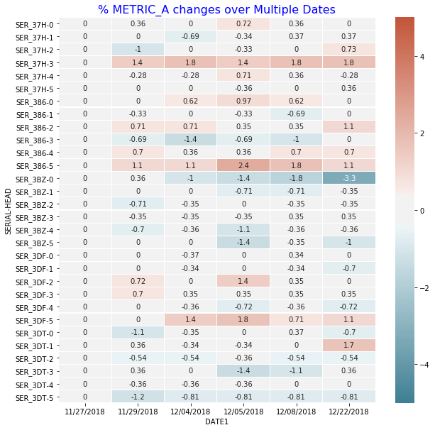
A particular concern with testing hard disk drives over multiple times is the quality of certain drives may degrade (wear and tear) over time and we failed to detect this degradation.
We have certain metrics to gauge any degradation symptom observed for a particular head in a particular drive. For example, with metric A, we are looking at the % change over time reference to the date of the first test o determine whether a head is degraded.
Below python code will base on the following table to generate the required heatmap for easy visualization.
Calculating %Change
import seaborn as sns
import numpy as np
import pandas as pd
import matplotlib.pyplot as plt

df1['DATE1'] = df1.DATE.dt.strftime('%m/%d/%Y')
df1 = df1.sort_values(by = 'DATE1')

# calculate the metric % change and
# actual change with reference to each individual head first data

df1['METRIC_A_PCT_CHANGE'] = df1.groupby(['SERIAL','HEAD'])['METRIC_A']\
                            .apply(lambda x: x.div(x.iloc[0]).subtract(1).mul(100))
df1['METRIC_A_CHANGE'] = df1.groupby(['SERIAL','HEAD'])['METRIC_A']\
                         .apply(lambda x: x - x.iloc[0])
Plotting in HeapMap
fig, ax = plt.subplots(figsize=(10,10))

# Pivot it for plotting in heap map
ww = df1.pivot_table(index = ['SERIAL','HEAD'], \
                     columns = 'DATE1', values = "METRIC_A_PCT_CHANGE")

g = sns.heatmap(ww, vmin= -5, vmax = 5, center = 0, \
                cmap= sns.diverging_palette(220, 20, sep=20, as_cmap=True),\
                xticklabels=True, yticklabels=True, \
                ax = ax, linecolor = 'white', linewidths = 0.1, annot = True)

g.set_title("% METRIC_A changes over multiple Dates", \
            fontsize = 16, color = 'blue')
Generated Plots
From the heap map, SER_3BZ-0 have some indication of degradation with increasing % Metric A loss over the different test date.
Notes
Getting the % percentage change relative to first value of each group.
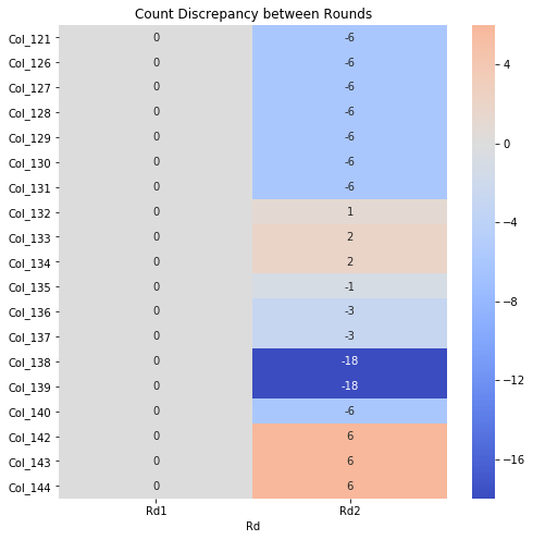
In one aspect of my work, we have a group of samples undergoing several rounds of modifications with same set of tests being performed at each round. For each test, parameters for each sample are collected. For some samples, a particular test may fail in certain rounds resulting in no/missing parameters being collected for that test.
When we compare the performance of the samples especially grouping as a mean, missing parameters from certain samples at certain rounds may skew the results. To ensure accuracy, we need to ensure matching samples data. As there are multiple tests and few hundreds parameters being tracked, we need a way to keep track of the parameters that have mismatch parameters between rounds.
A simple way will be to use the heat map to highlight parameters that have discrepancy in number of counts (this will mean that some samples are missing in data) between rounds. The script is generated using mainly Pandas and Seaborn.
Steps
Group the counts for each parameter for each round.
Use one round as reference (default 1st round), take the differences in counts for each parameter for each round.
Display as heat map for only rounds that have discrepancy.
import os, sys, datetime, re
import pandas as pd
import numpy as np
import seaborn as sns
import matplotlib.pyplot as plt

# retrieve zone data
rawfile = 'raw_data.csv'
raw_df = pd.read_csv(rawfile)

# count of data in group
cnt_df = raw_df.groupby(['round']).count()

# Substract the first to the rest
diff_df = cnt_df.subtract(cnt_df.iloc[0], axis = 1)

# drop columns where it is all zeros, meaning exclude data that are matched.
diff_df.loc[:, diff_df.any()]

fig, ax = plt.subplots(figsize=(10,10))

sns.heatmap(diff_df.loc[:, diff_df.any()].T,  xticklabels=True, yticklabels=True, ax =ax , annot=True, fmt="d", center= 0 ,  cmap="coolwarm")
plt.tight_layout()