Work Projects

Easy Web Scraping with Google Sheets

Google sheets simplify the process of web scraping especially for table and list elements. For below project, the purpose is to obtain common/essential words and their corresponding definitions for GMAT/GRE preparations.

Below are examples of each.

Table type extraction (source)

In one of the cells, type in =IMPORTHTML(url-site,“table”,<table_id>) where <table_id> is the table position in the url (either guess or iterate from 1 to XXX etc or use chrome developer tools to count the table num)  

tabletypeexample

tabletypeexamplegooglesheet


List Type Extraction (source)

In one of the cells, type in =IMPORTHTML(url-site,“list”,<list_id>) where <list_id> is the list order in the url (either guess or iterate from 1 to XXX etc or use chrome developer tools to count the list num)  

listtypeexamplegooglesheet

listtypeexamplegooglesheet1

The above techniques can also apply to other websites that have list or table elements. For this project, one of the next step is to create flash cards video to help in the learning. With the table format in google sheets, it is easy to download the whole list or table as .CSV file and create in the form of flash cards. Check the link for the quick project.


Easy Create Mosaic Plot using Stacked Bar Chart

Creating Mosaic Plot

In one of my work project, I need to use mosaic plot to visualize the proportion of different variables/elements exists in each group.  It is hard to find a readily available mosaic plot function (from Seaborn etc) which can be easily customized. By reading some of the blogs, mosaic plot can be created using stacked bar chart concept by performing some transformation on the raw data and overlaying individual bar charts. With this knowledge and using python Pandas and Matplotlib, I am able to create a mosaic plot that is good enough for my need.

Sample Data Sets

A sample data set is as shown below. We need to plot the proportion of b, g, r (all the columns) for each index (0 to 4). Based on the format of the data set, we make a transformation of the columns to be able to have Mosaic Plot.

Sorry, something went wrong. Reload?
Sorry, we cannot display this file.
Sorry, this file is invalid so it cannot be displayed.

Breaking down the data transformation for stacked bar chart plotting

We perform two transformations as followed. Mosaic plot requires the sum of  proportion of categories for each group to be 1.0 or 100%. Stacked bar chart can achieve this by summing or stacking values for each element in the group but we would need to ensure the values are normalized and the sum of all elements in a group equal to 1 (i.e r+ g+b =1 for each index).

To simulate the effect of stacked bar chart , the trick is to use multiple bar charts to overlay on top of each other to simulate the effect of stacked bar chart. To be able to create the stacked effect, the ratio/proportion of the stacked element need to be the sum of proportion value of “bottom” elements + the proportion value of the element itself. This can be easily achieved by doing a cumulative sum along the row axis.

As example below, r will be used as a base (since values are based on b + g + r). g will overlay on top of r since it is summation of b + g. b will be final layer overlay on g and r.

Sorry, something went wrong. Reload?
Sorry, we cannot display this file.
Sorry, this file is invalid so it cannot be displayed.

Mosaic plot function

Once the transformations are done, it is easy to plot the mosaic plot by plotting the different bar charts and overlaying on top of each other. Additional module adjustText can be used to prevent overlapping of the text labels in the plot. Based on the above, we can create a general mosaic function as below.

Sorry, something went wrong. Reload?
Sorry, we cannot display this file.
Sorry, this file is invalid so it cannot be displayed.


Using k-means clustering to detect abnormal profile or sudden trough

Background

For a particular test we are handling, we need to ensure a particular metric A maintain a certain parabolic or relatively flat profile across a range of metric B. In recent days, we encountered an issue where certain samples of the population are experiencing a significant and sudden drop in metric A within a sub range of metric B.

We need to comb through the population to detect those that has the abnormal profile as shown in chart below for further failure analysis. While it is easy to identify by eye which sample are seeing abnormal performance after plotting metric B against metric A, it is impossible to scan through all the plots to identify the problem sample.

normal_vs_abnormal_profile

I decide to use machine learning to comb through the population to get the defective samples. Given the limited training samples on hand and the hassle of getting more data, I will use unsupervised learning for quick detection in this case.

** Note the examples below are set to be to randomly generated as model to the real data set.

Pre-processing

There are certain pre-processing done on actual data but not on the sample data. Some of the usual pre-processing tasks performed are illustrated below.

  1. check and remove missing data (can use pd.isnan().sum()
  2. drop non required columns (pd.drop())

Features Engineering

To detect the abnormal profile, I need to build the features that might be able to differentiate normal vs abnormal profile. Below are some of the features I can think of which is derived by aggregating Metric A measured across all Metric B for each sample:

  1. Standard deviation of Metric A
    • Abnormal profile will have larger stddev due to the sharp drop.
  2. Range of Metric A
    • larger range of max – min for the abnormal profile.
  3. Standard deviation of Running delta of Metric A
    • Running delta is defined as the delta of Metric A for particular Metric B against Metric A of previous Metric B. A sudden dip in Metric A will be reflected in the sudden large delta.
    • Standard deviation of the running delta will catch the variation in the rise and dip.
  4. Max of Running delta of Metric A
    • This will display the largest delta within a particular sample.

Scaling and K-means Clustering

A basic scaling is done to normalize the features before applying the KMeans. All the functions will be from SkLearn. KMeans cluster is set to 2 (normal vs abnormal profile)

Results

This is a short and quick way to get some of the samples out for failure analysis but will still need further fine tuning if turn on for production modes.

Sample Script

Sorry, something went wrong. Reload?
Sorry, we cannot display this file.
Sorry, this file is invalid so it cannot be displayed.


Monitoring quality over time with heap map

A particular concern with testing hard disk drives over multiple times is the quality of certain drives may degrade (wear and tear) over time and we failed to detect this degradation.

We have certain metrics to gauge any degradation symptom observed for a particular head in a particular drive. For example, with metric A, we are looking at the % change over time reference to the date of the first test o determine whether a head is degraded.

Below python code will base on the following table to generate the required heatmap for easy visualization.

untitled

Calculating %Change

import seaborn as sns
import numpy as np
import pandas as pd
import matplotlib.pyplot as plt

df1['DATE1'] = df1.DATE.dt.strftime('%m/%d/%Y')
df1 = df1.sort_values(by = 'DATE1')

# calculate the metric % change and
# actual change with reference to each individual head first data

df1['METRIC_A_PCT_CHANGE'] = df1.groupby(['SERIAL','HEAD'])['METRIC_A']\
                            .apply(lambda x: x.div(x.iloc[0]).subtract(1).mul(100))
df1['METRIC_A_CHANGE'] = df1.groupby(['SERIAL','HEAD'])['METRIC_A']\
                         .apply(lambda x: x - x.iloc[0])

Plotting in HeapMap

fig, ax = plt.subplots(figsize=(10,10))

# Pivot it for plotting in heap map
ww = df1.pivot_table(index = ['SERIAL','HEAD'], \
                     columns = 'DATE1', values = "METRIC_A_PCT_CHANGE")

g = sns.heatmap(ww, vmin= -5, vmax = 5, center = 0, \
                cmap= sns.diverging_palette(220, 20, sep=20, as_cmap=True),\
                xticklabels=True, yticklabels=True, \
                ax = ax, linecolor = 'white', linewidths = 0.1, annot = True)

g.set_title("% METRIC_A changes over multiple Dates", \
            fontsize = 16, color = 'blue')


Generated Plots

From the heap map, SER_3BZ-0 have some indication of degradation with increasing % Metric A loss over the different test date.

untitled

Notes

  • Getting the % percentage change relative to first value of each group.
    • df.groupby(‘security’)[‘price’].apply(lambda x: x.div(x.iloc[0]).subtract(1).mul(100))


Custom Contour Plots with Labelled points

Creating Customized Contour Plots with Labelled Points

I was asked to create a customized contour plot based on a chart (Fig 1 ) found in IEEE Transactions on Magnetics journal with some variant in requirements. The chart shows the areal density capacity (ADC) demo of certain samples on a bit density (BPI) by track density (TPI) chart. The two different contours shown in the plot are made up of ADC (BPI * TPI) and bit aspect ratio BAR (BPI/TPI).

A way to create the plot might be to generate the contours based on Excel and manually added in the different points. This proves to be too much work. Therefore, a simpler way is needed. Further requirements include having additional points (with labels) to be added in fairly easily and charts with different sets of data can be recreated rapidly.

Creating the Contours

The idea will be to use the regression plots for both the ADC and the BAR contours while the points and labels can be automatically added to the plots after reading from an Excel table (or csv file). The regression plots are based on seaborn lmplot and the points with labels are annotated on the chart based on the individual x, and y values.

Besides the seaborn, pandas, matplotlib and numpy,  additional module adjustText is used to prevent overlapping of the text labels in the plot

import seaborn as sns
import pandas as pd
import numpy as np
import matplotlib.pyplot as plt
from adjustText import adjust_text

## Create GridLines for the ADC GBPSI
ADC_tgt = range(650,2150,50)
BPI_tgt = list(range(800,2700,20))*3
data_list = [ [ADC, BPI, ADC*1000/BPI] for BPI in BPI_tgt for ADC in ADC_tgt]
ADC_df = pd.DataFrame(data_list, columns=['Contour','X','Y']) #['ADC','TPI','BPI']
ADC_df['Contour'] = ADC_df['Contour'].astype('category')

## Create GridLines for the BAR
BAR_tgt =[1.0,1.5,2.0, 2.5,3.0,3.5,4.0,4.5,5.0,5.5,6.0,6.5]
BPI_tgt = list(range(800,2700,20))*3
data_list = [ [BAR, BPI, BPI/BAR] for BPI in BPI_tgt for BAR in BAR_tgt]
BAR_df = pd.DataFrame(data_list, columns=['Contour','X','Y']) #['BAR','TPI','BPI']
BAR_df['Contour'] = BAR_df['Contour'].astype('category')

combined_df = pd.concat([ADC_df,BAR_df])

Adding the demo points with text from Excel

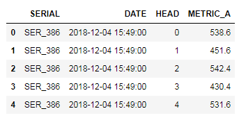
The various points are updated in the excel sheet (or csv) , shown in fig 2, and read using pandas. Two data frames are produced, pts_df and text_df which is the dataframe from the points and the associated text. These, together with the contour data frame from above, are then feed into the seaborn lmplot. Note the points shown in the Excel and plots are randomly generated.

class ADC_DataPts():

    def __init__(self, xls_fname, header_psn = 0):
        self.xls_fname = xls_fname
        self.header_psn = header_psn
        self.data_df = pd.read_excel(self.xls_fname, header = self.header_psn)

    def generate_pts_text_df(self):
        pts_df = self.data_df['X Y Color'.split()]
        text_df = self.data_df['X_TxtPsn Y_TxtPsn TextContent'.split()]
        return pts_df, text_df

data_excel = r"yourexcelpath.xls"
adc_data = ADC_DataPts(data_excel, header_psn =1)
pts_df, text_df = adc_data.generate_pts_text_df()

Seaborn lmplot

The seaborn lmplot is used for the contours while the points are individually annotated on the graph

def generate_contour_plots_with_points(xlabel, ylabel, title):

    # overall settings for plots
    sns.set_context("talk")
    sns.set_style("whitegrid", \
                  {'grid.linestyle': ':', 'xtick.bottom': True, 'xtick.direction': 'out',\
                    'xtick.color': '.15','axes.grid' : False}
                 )

    # Generate the different "contour"
    g = sns.lmplot("X", "Y", data=combined_df, hue='Contour', order =2, \
               height =7, aspect =1.5, ci =False, line_kws={'color':'0.9', 'linestyle':':'}, \
                scatter=False, legend_out =False)

    # Bold the key contour lines
    for n in [1.0,2.0,3.0]:
        sub_bar = BAR_df[BAR_df['Contour']==n]
        #generate the bar contour
        g.map(sns.regplot, x= "X", y="Y", data=sub_bar ,scatter= False, ci =False, \
              line_kws={'color':'0.9', 'linestyle':'-', 'alpha':0.05, 'linewidth':'3'})

    for n in [1000,1500,2000]:
        sub_adc = ADC_df[ADC_df['Contour']==n]
        #generate the bar contour
        g.map(sns.regplot, x= "X", y="Y", data=sub_adc ,scatter= False, ci =False, order =2, \
              line_kws={'color':'0.9', 'linestyle':'-', 'alpha':0.05, 'linewidth':'3'})#'color':'0.7', 'linestyle':'-', 'alpha':0.05, 'linewidth':'2'

    # Generate the different points
    for index, rows in pts_df.iterrows():
        g = g.map_dataframe(plt.plot, rows['X'], rows['Y'], 'o',  color = rows['Color'])# generate plot with differnt color or use annotation?

    ax = g.axes.flat[0]    

    # text annotation on points
    style = dict(size=12, color='black', verticalalignment='top')
    txt_grp = []
    for index, rows in text_df.iterrows():
        txt_grp.append(ax.text( rows['X_TxtPsn'], rows['Y_TxtPsn'], rows['TextContent'], **style) )#how to find space, separate data base

    style2 = dict(size=12, color='grey', verticalalignment='top')
    style3 = dict(size=12, color='grey', verticalalignment='top', rotation=30, alpha= 0.7)

    # Label the key contours
    ax.text( 2400, 430, '1000 Gfpsi', **style2)
    ax.text( 2400, 640, '1500 Gfpsi', **style2)
    ax.text( 2400, 840, '2000 Gfpsi', **style2) 

    ax.text( 1100, 570, 'BAR 2.0', **style3)
    ax.text( 1300, 460, 'BAR 3.0', **style3) 

    # Set x y limit
    ax.set_ylim(400,1000)
    ax.set_xlim(1000,2600)

    # Set general plot attributes
    g.set_xlabels(xlabel)
    g.set_ylabels(ylabel)
    plt.title(title)

    adjust_text(txt_grp, x = pts_df.X.tolist() , y = pts_df.Y.tolist() , autoalign = True, expand_points=(1.4, 1.4))

generate_contour_plots_with_points('kBPI', 'kTPI', "DEMO Areal Density Capability\n")
Untitled

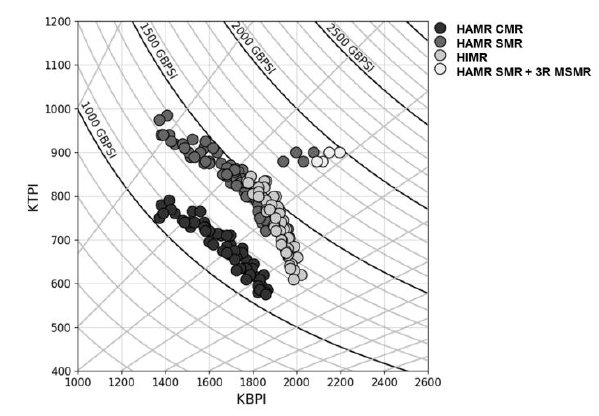
Fig 1: Sample plot from Heat-Assisted Interlaced Magnetic Recording IEEE Vol 54 No2

Untitled

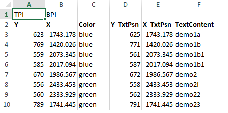
Fig2: Excel tables with associated demo points, the respective color and the text labels

Untitled

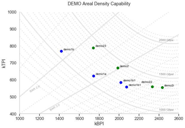
Fig 3: Generated chart with the ADC and BAR contours and demo pts with labels

Heap Map for discrepancy check

Monitoring counts discrepancy

In one aspect of my work, we have a group of samples undergoing several rounds of modifications with same set of tests being performed at each round. For each test, parameters for each sample are collected. For some samples, a particular test may fail in certain rounds resulting in no/missing parameters being collected for that test.

When we compare the performance of the samples especially grouping as a mean, missing parameters from certain samples at certain rounds may skew the results. To ensure accuracy, we need to ensure matching samples data. As there are multiple tests and few hundreds parameters being tracked, we need a way to keep track of the parameters that have mismatch parameters between rounds.

A simple way will be to use the heat map to highlight parameters that have discrepancy in number of counts (this will mean that some samples are missing in data) between rounds. The script is generated using mainly Pandas and Seaborn.

Steps

  1. Group the counts for each parameter for each round.
  2. Use one round as reference (default 1st round), take the differences in counts for each parameter for each round.
  3. Display as heat map for only rounds that have discrepancy.
import os, sys, datetime, re
import pandas as pd
import numpy as np
import seaborn as sns
import matplotlib.pyplot as plt

# retrieve zone data
rawfile = 'raw_data.csv'
raw_df = pd.read_csv(rawfile)

# count of data in group
cnt_df = raw_df.groupby(['round']).count()

# Substract the first to the rest
diff_df = cnt_df.subtract(cnt_df.iloc[0], axis = 1)

# drop columns where it is all zeros, meaning exclude data that are matched.
diff_df.loc[:, diff_df.any()]

fig, ax = plt.subplots(figsize=(10,10))  

sns.heatmap(diff_df.loc[:, diff_df.any()].T,  xticklabels=True, yticklabels=True, ax =ax , annot=True, fmt="d", center= 0 ,  cmap="coolwarm")
plt.tight_layout()

Untitled

Extra

Quick view of missing data using seaborn heatmap


sns.heatmap(df.isnull(), yticklabels=False, cbar = False, cmap = 'viridis')

missingdata