Types of plots:
- Multiple features histogram in single chart
- Diagonal Correlation Matrix
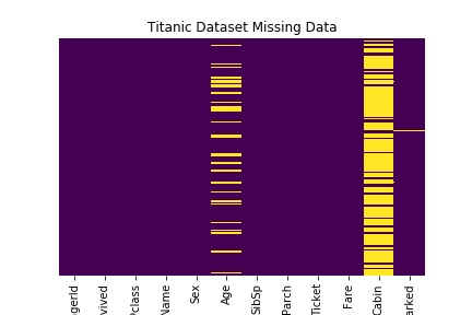
- Missing values Heat Map
Boston Housing prices dataset is used for 1, 2. Titanic Dataset for item 3.
Basic Python module import
import pandas as pd
import numpy as np
import seaborn as sns
import matplotlib.pyplot as plt
% matplotlib inline

from sklearn.datasets import load_boston
boston = load_boston()
X = boston.data
y = boston.target
df = pd.DataFrame(X, columns= boston.feature_names)
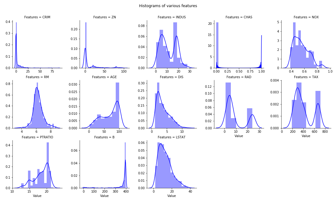
Multiple Histogram plots of numeric features
- Stack the dataframe with all the features together. May consume significant memory if dataset have large number of features and observations.
- If need to separate by group (hue in FacetGrid), can modify the numeric_features:
- numeric_features= df.set_index(‘Group’).select_dtypes(exclude=[“object”,”bool”])
numeric_features= df.select_dtypes(exclude=["object","bool"])
numeric_features = numeric_features.stack().reset_index().rename(columns = {"level_1":"Features",0:"Value"})
g = sns.FacetGrid(data =numeric_features, col="Features",  col_wrap=5, sharex=False, sharey=False)
g = g.map(sns.distplot, "Value", color ='blue')
plt.subplots_adjust(top=0.9)
plt.suptitle("Histograms of various features")
Diagonal Heat Map of Correlation Matrix
Reference: seaborn.pydata.org. Utilize the Seaborn heat map with masking of the upper diagonal.
f, ax = plt.subplots(figsize=(12, 12))
corr = df.select_dtypes(exclude=["object","bool"]).corr()

# TO display diagonal matrix instead of full matrix.
mask = np.zeros_like(corr, dtype=np.bool)
mask[np.triu_indices_from(mask)] = True

# Generate a custom diverging colormap.
cmap = sns.diverging_palette(220, 10, as_cmap=True)

# Draw the heatmap with the mask and correct aspect ratio.
g = sns.heatmap(corr, mask=mask, cmap=cmap, vmax=1, center=0, annot=True, fmt='.2f',\
square=True, linewidths=.5, cbar_kws={"shrink": .5})

# plt.subplots_adjust(top=0.99)
plt.title("Diagonal Correlation HeatMap")

Missing values Heat Map
Reference: Robin Kiplang’at github
dataset ='https://gist.githubusercontent.com/michhar/2dfd2de0d4f8727f873422c5d959fff5/raw/ff414a1bcfcba32481e4d4e8db578e55872a2ca1/titanic.csv'

titanic_df = pd.read_csv(dataset, sep='\t')
sns.heatmap(titanic_df.isnull(), yticklabels=False, cbar = False, cmap = 'viridis')

plt.title("Titanic Dataset Missing Data")