A particular concern with testing hard disk drives over multiple times is the quality of certain drives may degrade (wear and tear) over time and we failed to detect this degradation.
We have certain metrics to gauge any degradation symptom observed for a particular head in a particular drive. For example, with metric A, we are looking at the % change over time reference to the date of the first test o determine whether a head is degraded.
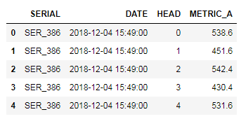
Below python code will base on the following table to generate the required heatmap for easy visualization.
Calculating %Change
import seaborn as sns
import numpy as np
import pandas as pd
import matplotlib.pyplot as plt

df1['DATE1'] = df1.DATE.dt.strftime('%m/%d/%Y')
df1 = df1.sort_values(by = 'DATE1')

# calculate the metric % change and
# actual change with reference to each individual head first data

df1['METRIC_A_PCT_CHANGE'] = df1.groupby(['SERIAL','HEAD'])['METRIC_A']\
                            .apply(lambda x: x.div(x.iloc[0]).subtract(1).mul(100))
df1['METRIC_A_CHANGE'] = df1.groupby(['SERIAL','HEAD'])['METRIC_A']\
                         .apply(lambda x: x - x.iloc[0])
Plotting in HeapMap
fig, ax = plt.subplots(figsize=(10,10))

# Pivot it for plotting in heap map
ww = df1.pivot_table(index = ['SERIAL','HEAD'], \
                     columns = 'DATE1', values = "METRIC_A_PCT_CHANGE")

g = sns.heatmap(ww, vmin= -5, vmax = 5, center = 0, \
                cmap= sns.diverging_palette(220, 20, sep=20, as_cmap=True),\
                xticklabels=True, yticklabels=True, \
                ax = ax, linecolor = 'white', linewidths = 0.1, annot = True)

g.set_title("% METRIC_A changes over multiple Dates", \
            fontsize = 16, color = 'blue')
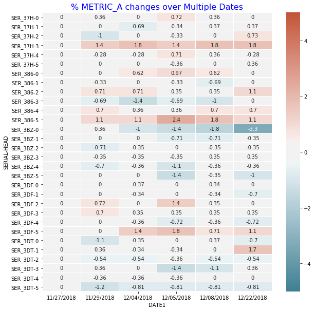
Generated Plots
From the heap map, SER_3BZ-0 have some indication of degradation with increasing % Metric A loss over the different test date.
Notes
- Getting the % percentage change relative to first value of each group.
- df.groupby(‘security’)[‘price’].apply(lambda x: x.div(x.iloc[0]).subtract(1).mul(100))
