Python

Predict Product Attributes From Product Listing Title — Text Feature Extraction and Classification

Extracting Attributes from Product Title and Image

This is a National (Singapore) Data Science Challenge organised by Shopee hosted on Kaggle. In the advanced category, the tasks is to extract a list of attributes from each product listing given product title and the accompanied image (a text and a image input). Training sets and full instructions are available in the Kaggle link. This is a short attempt of the problem which include the basic data exploration, data cleaning, feature extraction and classification.

Basic Data Exploration

While the project requirement have 3 main product categories, Beauty, Mobile, & Fashion, I will just focus on the Mobile data set. The two other categories will follow the same approach. For the mobile data set, the requirement is to extract the following attributes such as Brand, Phone Model, Camera, Phone Screen Size, Color Family.  A brief exploration of the training data set observed.

  1. Only title (text) & image (pic) available to predict the several attributes
    of the product.
  2. The attributes are already label-encoded.
  3. There are a lot of missing values particularly like Network Connections etc have more than 80% of data missing. This is quite expected as sellers unlikely to put some of these more obscured attributes in the title description while attributes like Brand and Model should have less missing data.
Sorry, something went wrong. Reload?
Sorry, we cannot display this file.
Sorry, this file is invalid so it cannot be displayed.

From seller’s perspective, seller will try to include as much information as possible in a
concise manner especially attributes like brands, models etc to make their posting relevant to search and stand out to the buyers. Using only image to extract attributes such as Brand and model might be difficult especially for mobile category where it is difficult to differentiate from pic even with human eye.

From the exploration, I planned the following steps.

  1. Using title (text) as main classification input and ignore images.
  2. Train and predict each attribute at a time.

Basic Data and Text Cleaning

There are some attributes Network Connections, Warranty Period which have large proportion of missing data. However, those attributes have majority of the observations having a certain attribute. In this case, those missing values are assigned with the mode of the training population (e.g. it is likely for Network Connections , most phones should be 4G etc). The attributes are also converted to integer for training purpose.

For the title, before extracting the numeric features, we perform cleaning on the data set. Since most users would highlight the most important feature in the product tile to make their product stand out and relevant, they would generally have omitted most of the stop words, most punctuation. and white spaces Hence for this data set, I will try minimal cleaning: change the title to lowercase and remove special characters. This can reduce a significant amount of time in text cleaning especially for large data set.

Sorry, something went wrong. Reload?
Sorry, we cannot display this file.
Sorry, this file is invalid so it cannot be displayed.

Data Cleaning and pipelines

For the advanced data extraction, I chose the Bag-Of-Word (BOW) model to generate the features from the text columns. In the BOW model, I use TF-IDF approach which computes the weighted frequency of each word in each title. For classification, SVM is chosen as the classifier. Pipe-lining makes it easy to streamline the whole text processing and attributes classification making it run on all the different attributes.

Below is the complete code running from extraction, cleaning to classification.

Sorry, something went wrong. Reload?
Sorry, we cannot display this file.
Sorry, this file is invalid so it cannot be displayed.

Further Improvement

This is the starting point of the project and take only a few lines of code to get it up and running for quick analysis.  I will improve the existing code by incorporate gridsearch for hyperparameters and expanding on the pipelines and features in the subsequent posts.

See Also

  1. Predict Product Attributes from Product Listings Part 2 – Pipelines & GridSearch


Advertisement

Using k-means clustering to detect abnormal profile or sudden trough

Background

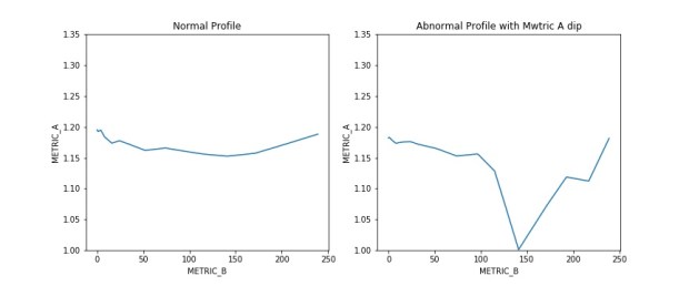
For a particular test we are handling, we need to ensure a particular metric A maintain a certain parabolic or relatively flat profile across a range of metric B. In recent days, we encountered an issue where certain samples of the population are experiencing a significant and sudden drop in metric A within a sub range of metric B.

We need to comb through the population to detect those that has the abnormal profile as shown in chart below for further failure analysis. While it is easy to identify by eye which sample are seeing abnormal performance after plotting metric B against metric A, it is impossible to scan through all the plots to identify the problem sample.

normal_vs_abnormal_profile

I decide to use machine learning to comb through the population to get the defective samples. Given the limited training samples on hand and the hassle of getting more data, I will use unsupervised learning for quick detection in this case.

** Note the examples below are set to be to randomly generated as model to the real data set.

Pre-processing

There are certain pre-processing done on actual data but not on the sample data. Some of the usual pre-processing tasks performed are illustrated below.

  1. check and remove missing data (can use pd.isnan().sum()
  2. drop non required columns (pd.drop())

Features Engineering

To detect the abnormal profile, I need to build the features that might be able to differentiate normal vs abnormal profile. Below are some of the features I can think of which is derived by aggregating Metric A measured across all Metric B for each sample:

  1. Standard deviation of Metric A
    • Abnormal profile will have larger stddev due to the sharp drop.
  2. Range of Metric A
    • larger range of max – min for the abnormal profile.
  3. Standard deviation of Running delta of Metric A
    • Running delta is defined as the delta of Metric A for particular Metric B against Metric A of previous Metric B. A sudden dip in Metric A will be reflected in the sudden large delta.
    • Standard deviation of the running delta will catch the variation in the rise and dip.
  4. Max of Running delta of Metric A
    • This will display the largest delta within a particular sample.

Scaling and K-means Clustering

A basic scaling is done to normalize the features before applying the KMeans. All the functions will be from SkLearn. KMeans cluster is set to 2 (normal vs abnormal profile)

Results

This is a short and quick way to get some of the samples out for failure analysis but will still need further fine tuning if turn on for production modes.

Sample Script

Sorry, something went wrong. Reload?
Sorry, we cannot display this file.
Sorry, this file is invalid so it cannot be displayed.


Convert Jupyter Notebook into Gist fast with Gist-it

Easy way to convert Jupyter Notebook into Gist.

  1. Required Tools:
      1. Jupyter extension package
  2. Steps:
      1. Install Jupyter extension and configurator
      2. Commands
        1. pip install jupyter_contrib_nbextensions
        2. jupyter contrib nbextension install
        3. pip install jupyter_nbextensions_configurator
        4. jupyter nbextensions_configurator enable
  3. Open notebook and there will be a new tab Nbextensions
  4. Select Gist it and enable it. See step 5 for further configuration.
  5. Note: somehow I cannot create anonymous gist even though Gist-it allows it. Therefore, would need to create a access token from Github.
  6. To generate the access token, go to link and click “generate  new token”. Provide a description and under scope, tick gist and click Generate token
  7. Copy the token string. Return to Gist-it parameters selection in Notebook and Copy the token into the GitHub personal access token. Tick Gists default to public and click Enable
  8. To gist a notebook, click on the Github icon, tick Make the gist public and enter a description, click Gist it!

Further notes 

Retrieving Stock statistics from Yahoo Finance using python

For this post, we are only going to scrape the “Key Statistics” page of a particular stock in Yahoo Finance. The usual way might be to use Requests and BeautifulSoup to parse the web page. However, with the table format in the targeted webpage, it is easier to use Pandas read_html and DataFrame function.

  1. Objectives:
      1. Retrieving stocks information (Key statistics) from Yahoo Finance.
  2. Required Tools:
      1. Python Pandas—  Using Pandas read_html function for reading web table form.

Usage — Pulling a particular stock data data

import pandas as pd

tgt_website = r'https://sg.finance.yahoo.com/quote/WDC/key-statistics?p=WDC'

def get_key_stats(tgt_website):

    # The web page is make up of several html table. By calling read_html function.
    # all the tables are retrieved in dataframe format.
    # Next is to append all the table and transpose it to give a nice one row data.
    df_list = pd.read_html(tgt_website)
    result_df = df_list[0]

    for df in df_list[1:]:
        result_df = result_df.append(df)

    # The data is in column format.
    # Transpose the result to make all data in single row
    return result_df.set_index(0).T

# Save the result to csv
result_df = get_key_stats(tgt_website)

Pulling all the stocks symbols

Here, we are pulling one known stock symbol. To get all the stocks in particular indices, the stock symbols need to be known first. The below code will extract all the stock symbols, along with other data, from the NASDAQ website. [Note: the NASDAQ website has changed format and the original method of getting the stock symbols is not valid. Please see the 2nd method to pull from eoddata website]

import pandas as pd

weblink = 'https://www.nasdaq.com/screening/companies-by-name.aspx?letter=A&render=download'
sym_df = pd.read_csv(weblink)
stock_symbol_list = sym_df.Symbol.tolist()

import string
import time
import pandas as pd

url_template = 'http://eoddata.com/stocklist/NASDAQ/{}.htm'

sym_df = pd.DataFrame()
for letter in list(string.ascii_uppercase):
    tempurl = url_template.format(letter)
    temp_data = pd.read_html(tempurl)
    temp_df = temp_data[4]
    if len(sym_df)==0:
        sym_df = temp_df
    else:
        sym_df = sym_df.append(temp_df)
    time.sleep(1)
stock_symbol_list = sym_df.Code.tolist()

Pulling key statistics for all stock symbols (for given index)

The last step will be to iterate all the symbols and get the corresponding key statistcis

all_result_df = pd.DataFrame()
url_prefix = 'https://sg.finance.yahoo.com/quote/{0}/key-statistics?p={0}'
for sym in stock_symbol_list:
    stock_url = url_prefix.format(sym)
    result_df = get_key_stats(stock_url)
    if len(all_result_df) ==0:
        all_result_df = result_df
    else:
        all_result_df = all_result_df.append(result_df)

# Save all results
all_result_df.to_csv('results.csv', index =False)

Monitoring quality over time with heap map

A particular concern with testing hard disk drives over multiple times is the quality of certain drives may degrade (wear and tear) over time and we failed to detect this degradation.

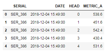
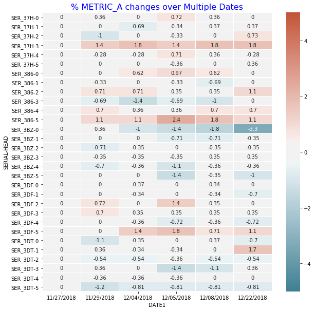
We have certain metrics to gauge any degradation symptom observed for a particular head in a particular drive. For example, with metric A, we are looking at the % change over time reference to the date of the first test o determine whether a head is degraded.

Below python code will base on the following table to generate the required heatmap for easy visualization.

untitled

Calculating %Change

import seaborn as sns
import numpy as np
import pandas as pd
import matplotlib.pyplot as plt

df1['DATE1'] = df1.DATE.dt.strftime('%m/%d/%Y')
df1 = df1.sort_values(by = 'DATE1')

# calculate the metric % change and
# actual change with reference to each individual head first data

df1['METRIC_A_PCT_CHANGE'] = df1.groupby(['SERIAL','HEAD'])['METRIC_A']\
                            .apply(lambda x: x.div(x.iloc[0]).subtract(1).mul(100))
df1['METRIC_A_CHANGE'] = df1.groupby(['SERIAL','HEAD'])['METRIC_A']\
                         .apply(lambda x: x - x.iloc[0])

Plotting in HeapMap

fig, ax = plt.subplots(figsize=(10,10))

# Pivot it for plotting in heap map
ww = df1.pivot_table(index = ['SERIAL','HEAD'], \
                     columns = 'DATE1', values = "METRIC_A_PCT_CHANGE")

g = sns.heatmap(ww, vmin= -5, vmax = 5, center = 0, \
                cmap= sns.diverging_palette(220, 20, sep=20, as_cmap=True),\
                xticklabels=True, yticklabels=True, \
                ax = ax, linecolor = 'white', linewidths = 0.1, annot = True)

g.set_title("% METRIC_A changes over multiple Dates", \
            fontsize = 16, color = 'blue')


Generated Plots

From the heap map, SER_3BZ-0 have some indication of degradation with increasing % Metric A loss over the different test date.

untitled

Notes

  • Getting the % percentage change relative to first value of each group.
    • df.groupby(‘security’)[‘price’].apply(lambda x: x.div(x.iloc[0]).subtract(1).mul(100))


Downloading YouTube Videos and converting to MP3

A simple guide to download videos from YouTube using python

  1. Objectives:
      1. Download YouTube Videos
      2. Saving as subclip (saving a portion of the video)
      3. Converting to MP3
      4.  
  2. Required Tools:
      1. PyTube— primarily for downloading youtube videos.
      2. MoviePy — for video editing and also convert to mp3.
      3.  
  3. Steps:
    1. pip install pytube and moviepy

Basic Usage

from pytube import YouTube
from moviepy.editor import *

# download a file from youtube
youtube_link = 'https://www.youtube.com/watch?v=yourtubevideos'
w = YouTube(youtube_link).streams.first()
w.download(output_path="/your/target/directory")

# download a file with only audio, to save space
# if the final goal is to convert to mp3
youtube_link = 'https://www.youtube.com/watch?v=targetyoutubevideos'
y = YouTube(youtube_link)
t = y.streams.filter(only_audio=True).all()
t[0].download(output_path="/your/target/directory")

Downloading videos from a YouTube playlist

import requests
import re
from bs4 import BeautifulSoup

website = 'https://www.youtube.com/playlist?list=yourfavouriteplaylist'
r= requests.get(website)
soup = BeautifulSoup(r.text)

tgt_list = [a['href'] for a in soup.find_all('a', href=True)]
tgt_list = [n for n in tgt_list if re.search('watch',n)]

unique_list= []
for n in tgt_list:
    if n not in unique_list:
        unique_list.append(n)

# all the videos link in a playlist
unique_list = ['https://www.youtube.com' + n for n in unique_list]

for link in unique_list:
    print(link)
    y = YouTube(link)
    t = y.streams.all()
    t[0].download(output_path="/your/target/directory")

Converting from MP4 to MP3 (from a folder with mp4 files)

import moviepy.editor as mp
import re
tgt_folder = "/folder/contains/your/mp4"

for file in [n for n in os.listdir(tgt_folder) if re.search('mp4',n)]:
full_path = os.path.join(tgt_folder, file)
output_path = os.path.join(tgt_folder, os.path.splitext(file)[0] + '.mp3')
clip = mp.AudioFileClip(full_path).subclip(10,) # disable if do not want any clipping
clip.write_audiofile(output_path)

Custom Contour Plots with Labelled points

Creating Customized Contour Plots with Labelled Points

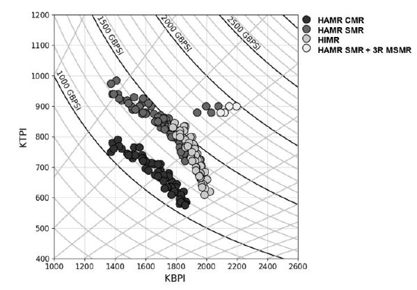
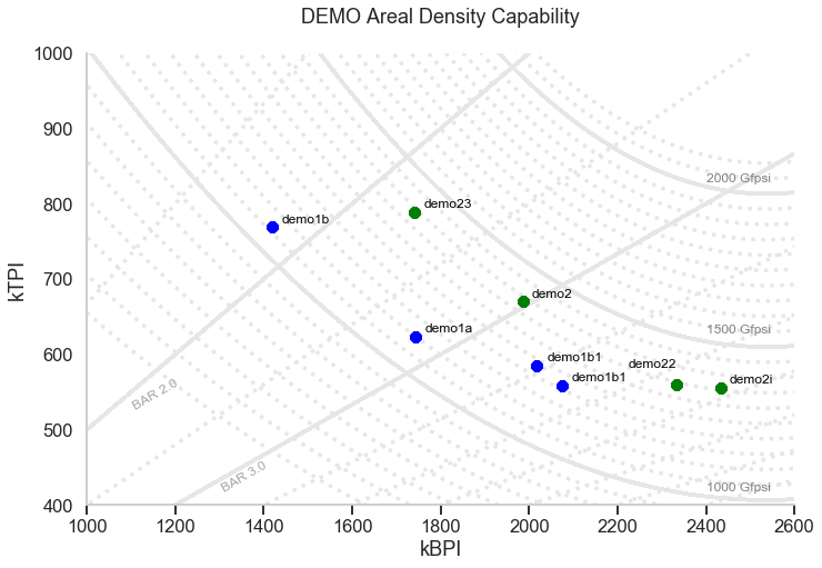
I was asked to create a customized contour plot based on a chart (Fig 1 ) found in IEEE Transactions on Magnetics journal with some variant in requirements. The chart shows the areal density capacity (ADC) demo of certain samples on a bit density (BPI) by track density (TPI) chart. The two different contours shown in the plot are made up of ADC (BPI * TPI) and bit aspect ratio BAR (BPI/TPI).

A way to create the plot might be to generate the contours based on Excel and manually added in the different points. This proves to be too much work. Therefore, a simpler way is needed. Further requirements include having additional points (with labels) to be added in fairly easily and charts with different sets of data can be recreated rapidly.

Creating the Contours

The idea will be to use the regression plots for both the ADC and the BAR contours while the points and labels can be automatically added to the plots after reading from an Excel table (or csv file). The regression plots are based on seaborn lmplot and the points with labels are annotated on the chart based on the individual x, and y values.

Besides the seaborn, pandas, matplotlib and numpy,  additional module adjustText is used to prevent overlapping of the text labels in the plot

import seaborn as sns
import pandas as pd
import numpy as np
import matplotlib.pyplot as plt
from adjustText import adjust_text

## Create GridLines for the ADC GBPSI
ADC_tgt = range(650,2150,50)
BPI_tgt = list(range(800,2700,20))*3
data_list = [ [ADC, BPI, ADC*1000/BPI] for BPI in BPI_tgt for ADC in ADC_tgt]
ADC_df = pd.DataFrame(data_list, columns=['Contour','X','Y']) #['ADC','TPI','BPI']
ADC_df['Contour'] = ADC_df['Contour'].astype('category')

## Create GridLines for the BAR
BAR_tgt =[1.0,1.5,2.0, 2.5,3.0,3.5,4.0,4.5,5.0,5.5,6.0,6.5]
BPI_tgt = list(range(800,2700,20))*3
data_list = [ [BAR, BPI, BPI/BAR] for BPI in BPI_tgt for BAR in BAR_tgt]
BAR_df = pd.DataFrame(data_list, columns=['Contour','X','Y']) #['BAR','TPI','BPI']
BAR_df['Contour'] = BAR_df['Contour'].astype('category')

combined_df = pd.concat([ADC_df,BAR_df])

Adding the demo points with text from Excel

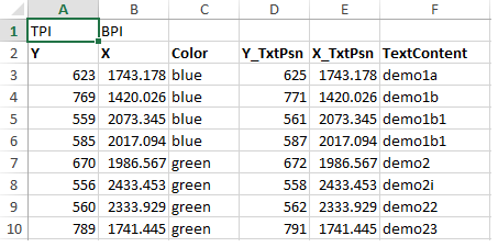
The various points are updated in the excel sheet (or csv) , shown in fig 2, and read using pandas. Two data frames are produced, pts_df and text_df which is the dataframe from the points and the associated text. These, together with the contour data frame from above, are then feed into the seaborn lmplot. Note the points shown in the Excel and plots are randomly generated.

class ADC_DataPts():

    def __init__(self, xls_fname, header_psn = 0):
        self.xls_fname = xls_fname
        self.header_psn = header_psn
        self.data_df = pd.read_excel(self.xls_fname, header = self.header_psn)

    def generate_pts_text_df(self):
        pts_df = self.data_df['X Y Color'.split()]
        text_df = self.data_df['X_TxtPsn Y_TxtPsn TextContent'.split()]
        return pts_df, text_df

data_excel = r"yourexcelpath.xls"
adc_data = ADC_DataPts(data_excel, header_psn =1)
pts_df, text_df = adc_data.generate_pts_text_df()

Seaborn lmplot

The seaborn lmplot is used for the contours while the points are individually annotated on the graph

def generate_contour_plots_with_points(xlabel, ylabel, title):

    # overall settings for plots
    sns.set_context("talk")
    sns.set_style("whitegrid", \
                  {'grid.linestyle': ':', 'xtick.bottom': True, 'xtick.direction': 'out',\
                    'xtick.color': '.15','axes.grid' : False}
                 )

    # Generate the different "contour"
    g = sns.lmplot("X", "Y", data=combined_df, hue='Contour', order =2, \
               height =7, aspect =1.5, ci =False, line_kws={'color':'0.9', 'linestyle':':'}, \
                scatter=False, legend_out =False)

    # Bold the key contour lines
    for n in [1.0,2.0,3.0]:
        sub_bar = BAR_df[BAR_df['Contour']==n]
        #generate the bar contour
        g.map(sns.regplot, x= "X", y="Y", data=sub_bar ,scatter= False, ci =False, \
              line_kws={'color':'0.9', 'linestyle':'-', 'alpha':0.05, 'linewidth':'3'})

    for n in [1000,1500,2000]:
        sub_adc = ADC_df[ADC_df['Contour']==n]
        #generate the bar contour
        g.map(sns.regplot, x= "X", y="Y", data=sub_adc ,scatter= False, ci =False, order =2, \
              line_kws={'color':'0.9', 'linestyle':'-', 'alpha':0.05, 'linewidth':'3'})#'color':'0.7', 'linestyle':'-', 'alpha':0.05, 'linewidth':'2'

    # Generate the different points
    for index, rows in pts_df.iterrows():
        g = g.map_dataframe(plt.plot, rows['X'], rows['Y'], 'o',  color = rows['Color'])# generate plot with differnt color or use annotation?

    ax = g.axes.flat[0]    

    # text annotation on points
    style = dict(size=12, color='black', verticalalignment='top')
    txt_grp = []
    for index, rows in text_df.iterrows():
        txt_grp.append(ax.text( rows['X_TxtPsn'], rows['Y_TxtPsn'], rows['TextContent'], **style) )#how to find space, separate data base

    style2 = dict(size=12, color='grey', verticalalignment='top')
    style3 = dict(size=12, color='grey', verticalalignment='top', rotation=30, alpha= 0.7)

    # Label the key contours
    ax.text( 2400, 430, '1000 Gfpsi', **style2)
    ax.text( 2400, 640, '1500 Gfpsi', **style2)
    ax.text( 2400, 840, '2000 Gfpsi', **style2) 

    ax.text( 1100, 570, 'BAR 2.0', **style3)
    ax.text( 1300, 460, 'BAR 3.0', **style3) 

    # Set x y limit
    ax.set_ylim(400,1000)
    ax.set_xlim(1000,2600)

    # Set general plot attributes
    g.set_xlabels(xlabel)
    g.set_ylabels(ylabel)
    plt.title(title)

    adjust_text(txt_grp, x = pts_df.X.tolist() , y = pts_df.Y.tolist() , autoalign = True, expand_points=(1.4, 1.4))

generate_contour_plots_with_points('kBPI', 'kTPI', "DEMO Areal Density Capability\n")

Untitled

Fig 1: Sample plot from Heat-Assisted Interlaced Magnetic Recording IEEE Vol 54 No2

Untitled

Fig2: Excel tables with associated demo points, the respective color and the text labels

Untitled

Fig 3: Generated chart with the ADC and BAR contours and demo pts with labels

Heap Map for discrepancy check

Monitoring counts discrepancy

In one aspect of my work, we have a group of samples undergoing several rounds of modifications with same set of tests being performed at each round. For each test, parameters for each sample are collected. For some samples, a particular test may fail in certain rounds resulting in no/missing parameters being collected for that test.

When we compare the performance of the samples especially grouping as a mean, missing parameters from certain samples at certain rounds may skew the results. To ensure accuracy, we need to ensure matching samples data. As there are multiple tests and few hundreds parameters being tracked, we need a way to keep track of the parameters that have mismatch parameters between rounds.

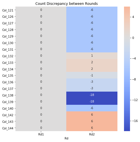
A simple way will be to use the heat map to highlight parameters that have discrepancy in number of counts (this will mean that some samples are missing in data) between rounds. The script is generated using mainly Pandas and Seaborn.

Steps

  1. Group the counts for each parameter for each round.
  2. Use one round as reference (default 1st round), take the differences in counts for each parameter for each round.
  3. Display as heat map for only rounds that have discrepancy.
import os, sys, datetime, re
import pandas as pd
import numpy as np
import seaborn as sns
import matplotlib.pyplot as plt

# retrieve zone data
rawfile = 'raw_data.csv'
raw_df = pd.read_csv(rawfile)

# count of data in group
cnt_df = raw_df.groupby(['round']).count()

# Substract the first to the rest
diff_df = cnt_df.subtract(cnt_df.iloc[0], axis = 1)

# drop columns where it is all zeros, meaning exclude data that are matched.
diff_df.loc[:, diff_df.any()]

fig, ax = plt.subplots(figsize=(10,10))  

sns.heatmap(diff_df.loc[:, diff_df.any()].T,  xticklabels=True, yticklabels=True, ax =ax , annot=True, fmt="d", center= 0 ,  cmap="coolwarm")
plt.tight_layout()

Untitled

Extra

Quick view of missing data using seaborn heatmap


sns.heatmap(df.isnull(), yticklabels=False, cbar = False, cmap = 'viridis')

missingdata

Hosting static website with GitHub Pages

Create static website with custom domain names. Perks is having your own web hosting at minimal cost. The only cost is the cost of the custom domain name.

Requirements:

  1. Github account: For hosting the static website.
  2. Custom domain name: Purchase domain names from GoDaddy or Namecheap etc. Alternatively, can use GitHub default url <username>.github.io

Steps:

  1. Github
    1. Create new repository with following format <username>.github.io where username refers to GitHub userid.
    2. In the repository, go to setting: Under Theme, choose a Jekyll theme. When finish, click on Source, select master branch. A file needs to exist in repository before Source option can be selected.
    3. If you have purchase your custom domain, you need to configure the A records and CNAME for the domain at the registrar to point to the GitHub site. Proceed to make the necessary changes at the domain registrar website.
  2. Registrar (Below is using GoDaddy as example)
    1. Under My Products, select the domain name that will be used. Click on Manage button.
    2. Once in setting page, scroll down to Additional Settings and click Manage DNS
    3. Within the DNS management page, Add in 4 “A” row with each pointing to IP as follows:
      1. 185.199.108.153
      2. 185.199.109.153
      3. 185.199.110.153
      4. 185.199.111.153
    4. Add in the CNAME pointing to your repository at Github: <username>.github.io
    5. View link for more info on configuring domain name with goDaddy
    6. Similarly, see following link for Namecheap
    7. Note: if you setup using A records and CNAME, leave the nameservers as default.
    8. Once the settings are configured, return to GitHub pages to add the custom domain name
  3. Github
    1. At the setting page, add the custom domain name in the Custom Domain section.
    2. Tick Enforce Https (may take up to 24 hours to take effect)
    3. Completed.
  4. Proceed to add in contents in GitHub using markdown.

Resources

Notes

  • GoDaddy default A records: 50.63.202.32


Radix Sort in Python

Background

  1. Non comparison integer sorting by grouping numbers based on individual digits or radix (base)
  2. Perform iteratively from least significant digit (LSD) to most significant digit (MSD) or recusively from MSD to LSD.
  3. At each iteration, sorting of target digit is based usually on Counting sort as subroutine.
  4. Complexity: O(d*n+b)) where b is the base for representing numbers eg 10. d is the number of digits. Close to Linear time if d is constant amount

Counting Sort as subroutine

  • Recap on the counting sort. See Counting Sort in Python for more info
  • Taking “get_sortkey ” function that generate the keys based on objects characteristics.
  • Modified the get_sortkey function to perform radix sort.
import random, math

def get_sortkey(n):
    """ Define the method to retrieve the key """
    return n

def counting_sort(tlist, k, get_sortkey):
    """ Counting sort algo with sort in place.
        Args:
            tlist: target list to sort
            k: max value assume known before hand
            get_sortkey: function to retrieve the key that is apply to elements of tlist to be used in the count list index.
            map info to index of the count list.
        Adv:
            The count (after cum sum) will hold the actual position of the element in sorted order
            Using the above, 

    """

    # Create a count list and using the index to map to the integer in tlist.
    count_list = [0]*(k)

    # iterate the tgt_list to put into count list
    for n in tlist:
        count_list[get_sortkey(n)] = count_list[get_sortkey(n)] + 1  

    # Modify count list such that each index of count list is the combined sum of the previous counts
    # each index indicate the actual position (or sequence) in the output sequence.
    for i in range(k):
        if i ==0:
            count_list[i] = count_list[i]
        else:
            count_list[i] += count_list[i-1]

    output = [None]*len(tlist)
    for i in range(len(tlist)-1, -1, -1):
        sortkey = get_sortkey(tlist[i])
        output[count_list[sortkey]-1] = tlist[i]
        count_list[sortkey] -=1

    return output

Radix sort with up to 3-digits numbers

  • Replace the get_sortkey with the get_sortkey2 which extract the integer based on the digit place and uses the counting sort at each iteration
# radix sort
from functools import partial

def get_sortkey2(n, digit_place=2):
    """ Define the method to retrieve the key
        return the key based on the digit place. Current set base to 10
    """
    return (n//10**digit_place)%10

## Create random list for demo counting sort.
random.seed(1)
tgt_list = [random.randint(20,400) for n in range(10)]
print("Unsorted List")
print(tgt_list)

## Perform the counting sort.
print("\nSorted list using counting sort")

output = tgt_list
for n in range(3):
    output = counting_sort(output, 30, partial(get_sortkey2, digit_place=n))
    print(output)

## output
# Unsorted List
# [88, 311, 52, 150, 80, 273, 250, 261, 353, 214]

# Sorted list using counting sort
# [150, 80, 250, 311, 261, 52, 273, 353, 214, 88]
# [311, 214, 150, 250, 52, 353, 261, 273, 80, 88]
# [52, 80, 88, 150, 214, 250, 261, 273, 311, 353]

See also:

Resources:

  1. Getting To The Root Of Sorting With Radix Sort